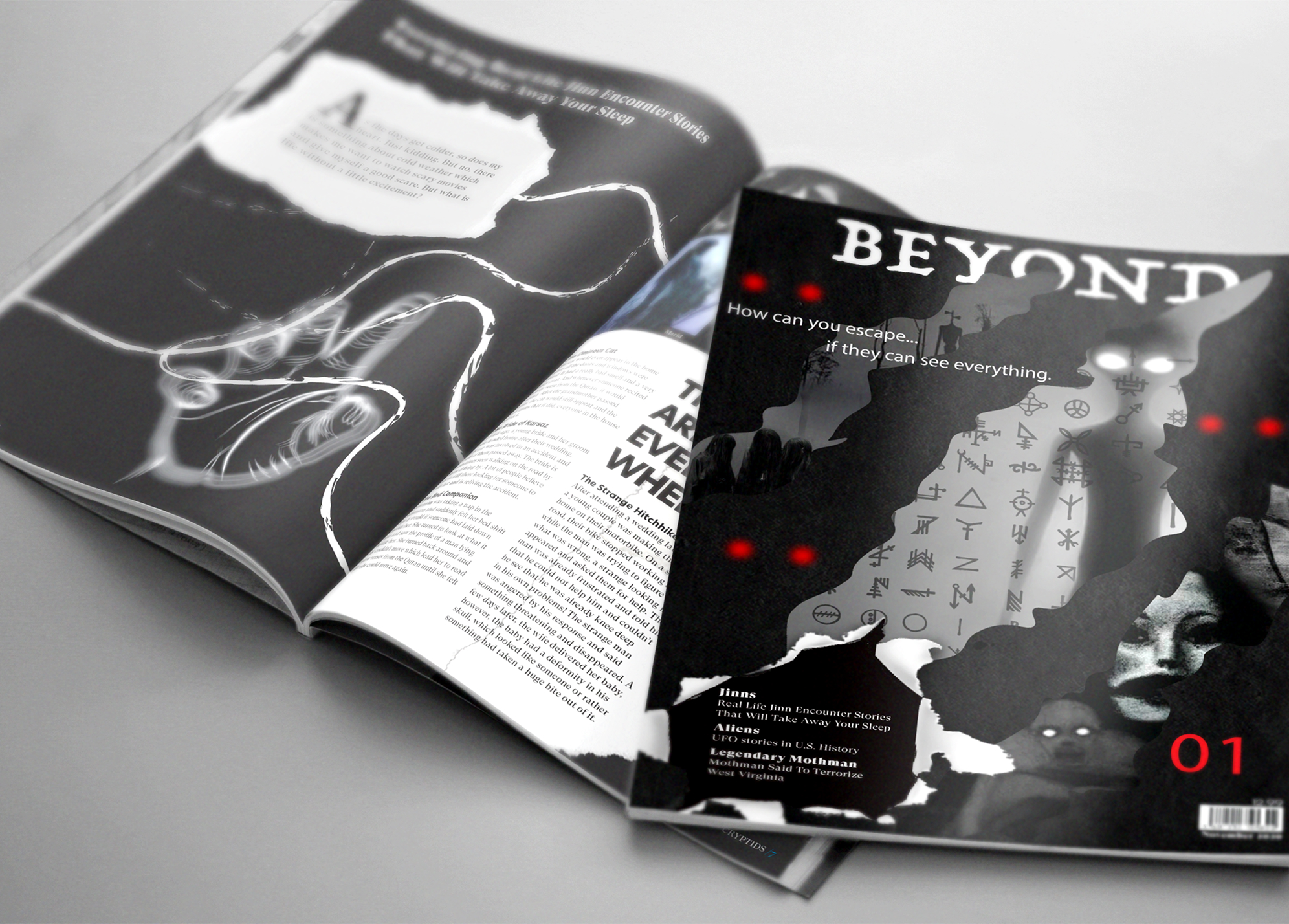
Beyond
Page layout
Monthly magazine about cryptids and legends from around the world.
Typography
Custom Typeface
Futura PT
Custom Typeface
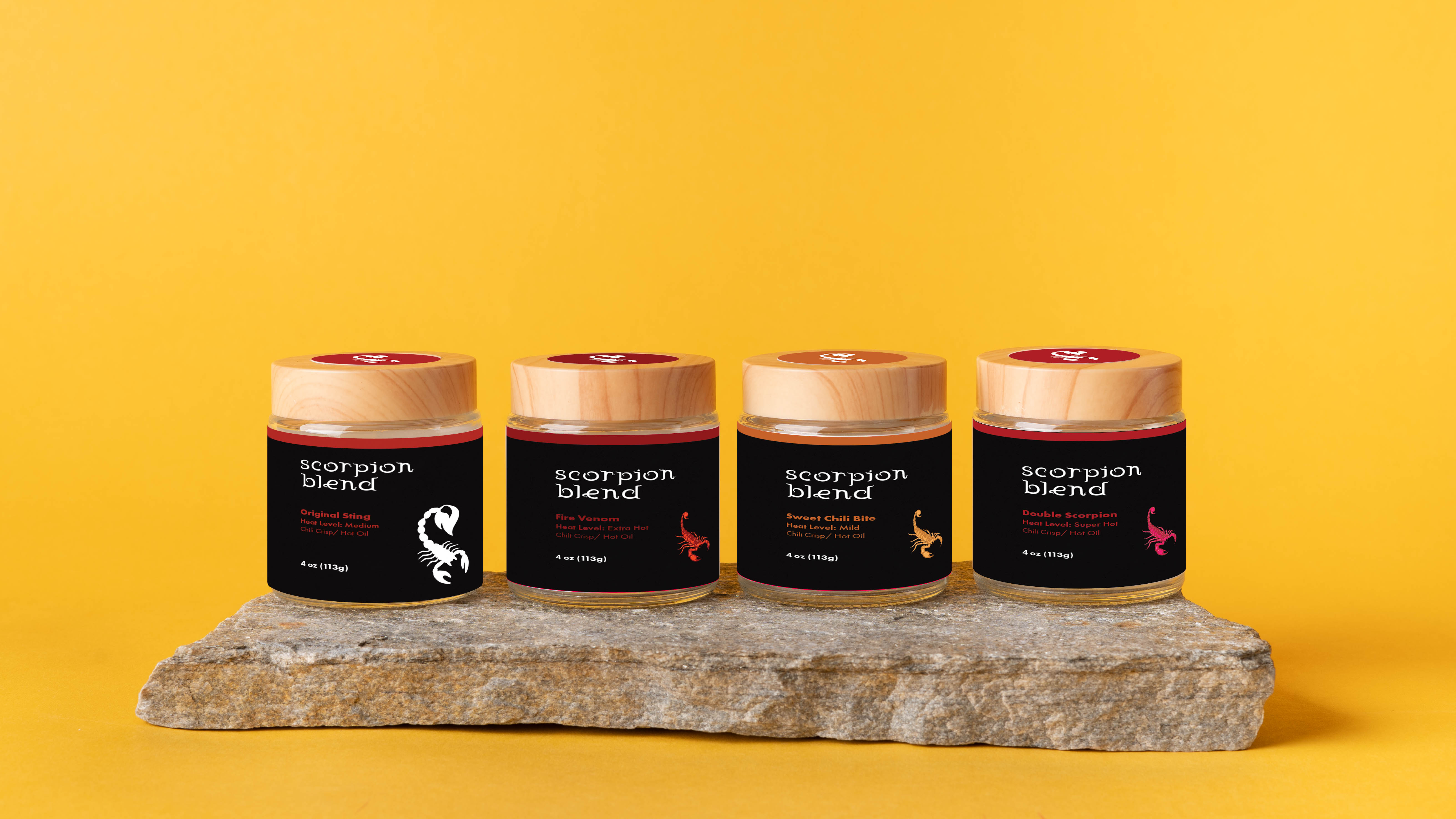
Scorpion Blend explores how illustration, typography, and color can communicate intensity, craftsmanship, and personality within food packaging. The goal was to design a cohesive visual identity for a chili crisp brand that feels bold, memorable, and shelf-ready while reflecting the heat and character of its ingredients.
The design focuses on custom illustration, strong typographic hierarchy, and a limited but impactful color system. A hand-drawn scorpion acts as the central brand symbol, reinforcing heat and attitude. Each flavor variation uses color shifts to maintain consistency while allowing differentiation. Label layouts were designed with clarity and balance in mind, ensuring legibility, brand recognition, and visual impact at a small scale.
Monthly magazine about cryptids and legends from around the world.